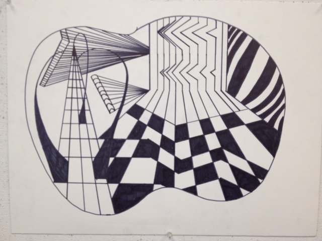
I approached this one corner at a time. What we did was find a workable and cut it into four pieces with our markers. We then used the different types of line "checklist" to brainstorm certain line patterns to create a feel of 3D and depth. I used Unity, contrast, diagonal, increasing weight lines, crosshatching, intersecting and parallel lines. I started with unity and then continued to add on to it for the other areas.
Balance
Dominance
Stability
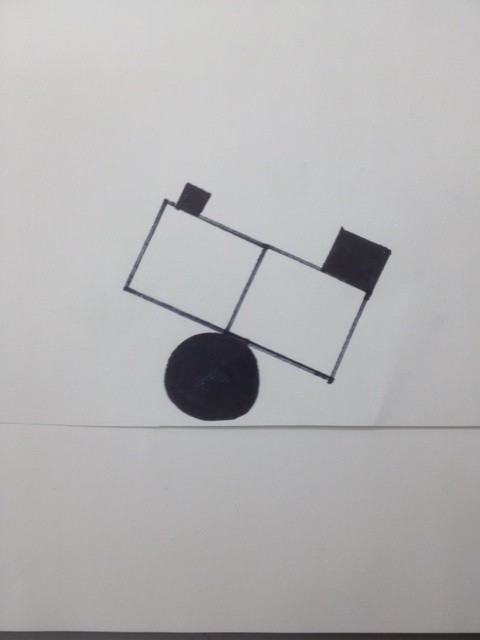
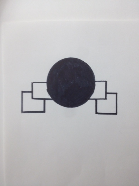
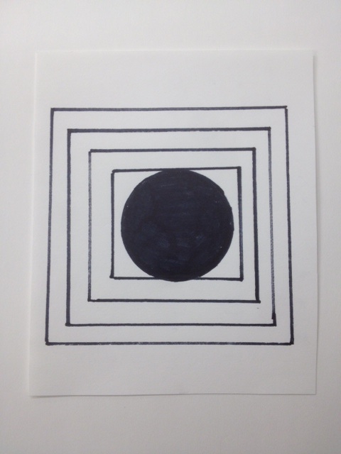
For our Balancing act drawing what we did was take four squares and circle. And arrange them in ways to demonstrate the nature of the vocabulary word. In balance, the size of the blocks represent a weight differential. For Dominance, the Ball appears to be on top and is Dominating. Almost like a King of the Mountain point of view. For Stability, the ball appears to be fitting in snuggly and is controlled by the other squares.
For our Balancing act drawing what we did was take four squares and circle. And arrange them in ways to demonstrate the nature of the vocabulary word. In balance, the size of the blocks represent a weight differential. For Dominance, the Ball appears to be on top and is Dominating. Almost like a King of the Mountain point of view. For Stability, the ball appears to be fitting in snuggly and is controlled by the other squares.
Transitional elements
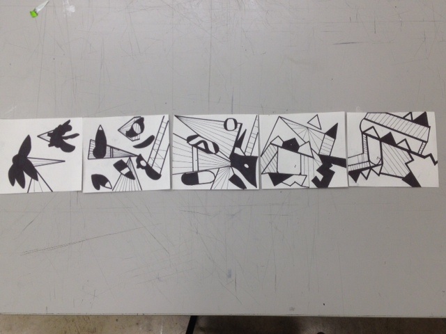
For this project, what we did was take two nature like shapes (organic) , and add to them to a point where they end up looking like the fifth installment of the project on the right. The first one is simple with organic and triangles, then the triangle start to enlarge and the individual "petals" are cut off. Then on the third the triangles are enlarged again and the petals form shapes to end up looking like the fourth and the fifth. Each shape is characterized and added to. The fifth is the final transformation.
For this project, what we did was take two nature like shapes (organic) , and add to them to a point where they end up looking like the fifth installment of the project on the right. The first one is simple with organic and triangles, then the triangle start to enlarge and the individual "petals" are cut off. Then on the third the triangles are enlarged again and the petals form shapes to end up looking like the fourth and the fifth. Each shape is characterized and added to. The fifth is the final transformation.
Color Wheel
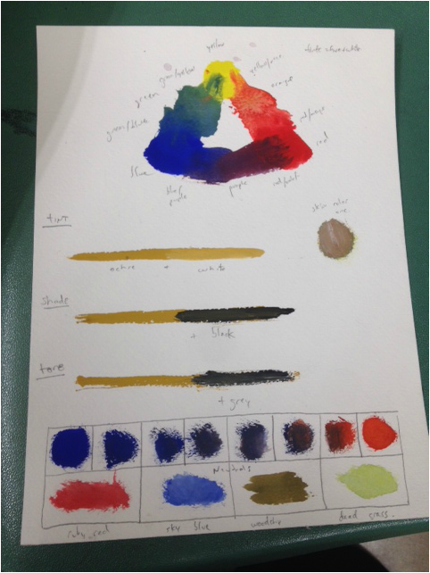
Color Page, Tints, Shade, Tone, Chromatic neutrals, and Imagery Colors, and skin tone
Ruby red, Sky blue, Woodchip Brown/ Grey, Dead Grass Green.
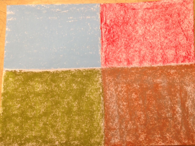
Jazz in the Park.
The dampness of the wood chips accentuate the previous night of rainfall from much needed rain, from the mist off the ocean. The Deadness of the Grass neutralizes the ruby color of the parks slides, matching the tone of this multi textural environment.
Jazz in the Park.
The dampness of the wood chips accentuate the previous night of rainfall from much needed rain, from the mist off the ocean. The Deadness of the Grass neutralizes the ruby color of the parks slides, matching the tone of this multi textural environment.
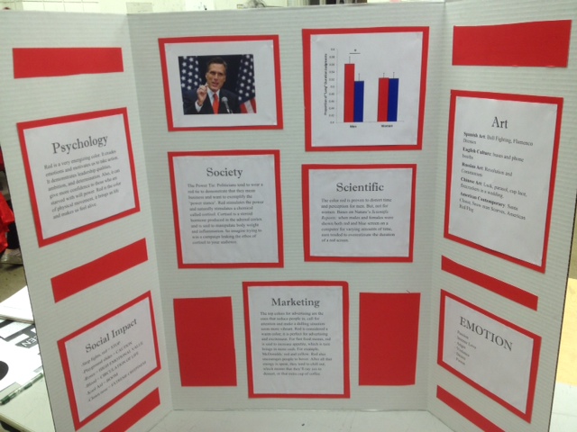
Color Research - Red was my chosen color. We were given a color to research emotion , psychology, scientific, and social impact of your color on society, on marketing, and art both historical and contemporary . I researched the topics of red and posted them on a presentation board. This made for a very easy talk where I people could follow along while I talked about the significance of the color red.
Orange - only color whose name came from an object
- optimistic
- Extraverted
Pink - personal health
- vibrancy
- Love
Red - Changes time perception for men, not women
- First named color after black and white
- Power, Lust, Danger
Blue - Lowest wavelength
- Cool color
- Sociable
Purple - 1000 dead snails make one gram of purple die
- Royalty color
- Family Orientation
Grey - pops colors
- grey in court = Justice
- Grey market representation
Green - balance
- Harmony
- Calming
Yellow - Vibrancy
- Charming
- Child
Black - Absence
- Mystery
- Gothic
white - Planeness
- Opaque
- Tint
POSSIBLE LOGO DESIGNS
For this project, the first thing we did was take a copy of a shape from nature. I used a tree branch of leaves. Then we added depth and patterns to modify the images. The second image was then cut and pasted into a new style of picture. It seemed as though they would make a great face. So i just change it as such.
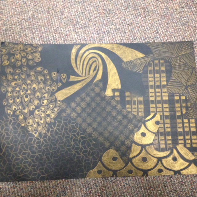
For this project we cut out a curvy, organic looking shape. And then used it as the outlines for different patterns. The patterns were in different boldness of color. There were about five different steps from light to gold. The bottom left is a two, the bottom right is a five and the middle is about a one.
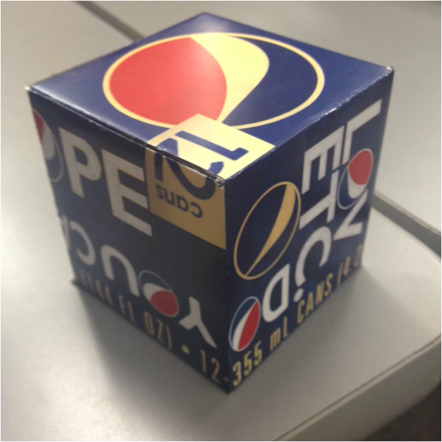
This was our pandora's box project Final. What we did for this was use photo shop and trace outline to make a six sided box with images (cropped from a box) and make it "wrap around'' using the vocab we have learned in class. First I took pictures of the pepsi box. And then used the magic wand to add and edit text icons. I then used the cut tools to wrap certain edges around the box using the grid.
